Tabs allow users to move between different views within the same context at the same level of hierarchy, e.g., UI vs. CLI, macOS vs. Windows vs. Linux, etc.
Usage
When to use
- Allows users to move between different views within the same context.
When not to use
- For navigation, consider navigation, Standalone Links, or Breadcrumb.
Spacing
Contained
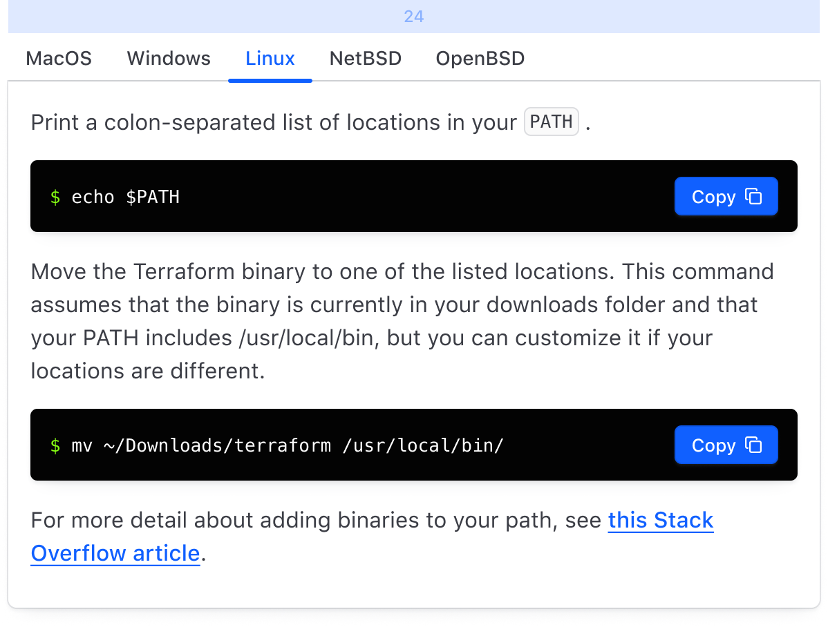
When the content area consists of a contained component (e.g., table, card, etc), we recommend:
- 24px above tabs
- 0px between the tabs and the content area
- Top & right border-radius of the content area be set to 0
- The content area should be flush on the left & right with the tabs
Nested
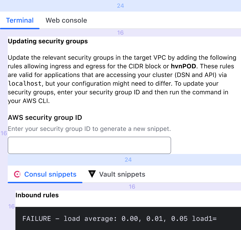
When nesting tabs, regardless of if your content area consists of contained or non-contained components; we recommend:
- 24px above each Tabs instance
- 16px between each Tabs instance and its corresponding content area
- Top & right border-radius of the content area be set to 0, if contained
- Each content area should be left indented by 16px
Not contained
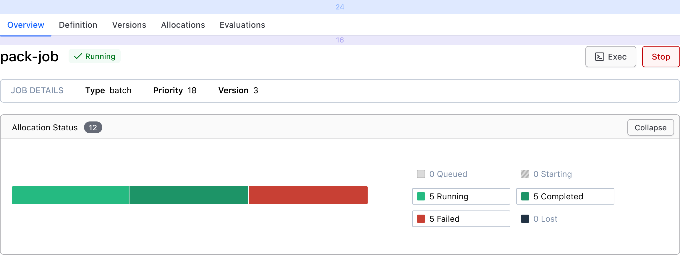
When the content area does not consist of a contained component (ie. text block, form, etc), we recommend:
- 24px above Tabs
- 16px between the Tabs and the content area
- The content area should be flush on the left & right with the Tabs, if only one level of tabs. If nested levels, see "Nested".
Overflow
Tabs will fill 100% of the parent container, unless explicitly set to something else. When there are too many tabs to fit within the TabList, a horizontal scrollbar will help the user navigation hidden tabs.
Content
Tabs should be short and concise, and a good indication of what content the user can expect to find within the TabPanel. They should not consist of full sentences.
Related
How to use this component
<Hds::Tabs as |T|>
  <T.Tab>One</T.Tab>
  <T.Tab>Two</T.Tab>
  <T.Tab>Three</T.Tab>

  <T.Panel>Content 1</T.Panel>
  <T.Panel>Content 2</T.Panel>
  <T.Panel>Content 3</T.Panel>
</Hds::Tabs>
Custom starting tab
Customize the starting tab to display on page load. The first tab is selected by default.
<Hds::Tabs as |T|>
<T.Tab>One</T.Tab>
<T.Tab>Two</T.Tab>
<T.Tab @isSelected=>Three</T.Tab>
<T.Panel>Content 1</T.Panel>
<T.Panel>Content 2</T.Panel>
<T.Panel>Content 3, I am displayed on page load.</T.Panel>
</Hds::Tabs>
Count and icon
<Hds::Tabs as |T|>
  <T.Tab @count="5">One</T.Tab>
  <T.Tab @icon="download">Two</T.Tab>
  <T.Tab>Three</T.Tab>

  <T.Panel>Content 1</T.Panel>
  <T.Panel>Content 2</T.Panel>
  <T.Panel>Content 3!</T.Panel>
</Hds::Tabs>
Call a function on tab click
Use the @onClickTab handler to pass in a custom function. For example, to store the active tab in the URL for persistence.
<Hds::Tabs @onClickTab= as |T|>
<T.Tab>One</T.Tab>
<T.Tab>Two</T.Tab>
<T.Tab>Three</T.Tab>
<T.Panel>Content one</T.Panel>
<T.Panel>Content two</T.Panel>
<T.Panel>Content three</T.Panel>
</Hds::Tabs>
Component API
The Tabs component is composed of different parts, with their own APIs:
TabscontainerTabchild componentsPanelchild components corresponding to each Tab
Tabs API
- Name
-
onClickTab - Type
-
function
- Name
-
…attributes - Description
-
This component supports use of
...attributes.
Tabs::Tab API
- Name
-
count - Type
-
string - Description
-
Displays an optional
countindicator in the tab. Accepts the text value that should go in Badge Count.
- Name
-
icon - Description
- Displays an optional icon in the tab. Accepts any icon name.
- Name
-
isSelected - Type
-
boolean - Default
-
- false (default)
- Description
- Customizes the initial tab to display when the page is loaded. The first tab is selected on page load by default.
- Name
-
yield - Description
-
Elements passed as children of this component are yielded inside a
buttonelement.
- Name
-
…attributes - Description
-
This component supports use of
...attributes.
Tabs::Panel API
- Name
-
yield - Description
-
Elements passed as children of this component are yielded inside a
sectionelement.
- Name
-
…attributes - Description
-
This component supports use of
...attributes.
Anatomy

| Element | Usage |
|---|---|
| Tab | Required, two minimum |
| Content area | Required, Tabs should never be used alone |

| Element | Usage |
|---|---|
| Selected | Required, one is always selected |
| Bottom border | Required |
| Icon | Optional |
| Text | Required |
| Count | Optional |
| Indicator | Required, displayed on selected Tab |
States

Conformance rating
Animation
No indicator animation will be present for users that have enabled prefers-reduced-motion.
Keyboard navigation
Focus on a tab
Activate tab to display matching content area
Move between tabs
Move to interactive element within the content area
Applicable WCAG Success Criteria
-
1.3.1
Info and Relationships (Level A):
Information, structure, and relationships conveyed through presentation can be programmatically determined or are available in text. -
1.3.2
Meaningful Sequence (Level A):
When the sequence in which content is presented affects its meaning, a correct reading sequence can be programmatically determined. -
1.4.1
Use of Color (Level A):
Color is not used as the only visual means of conveying information, indicating an action, prompting a response, or distinguishing a visual element. -
1.4.10
Reflow (Level AA):
Content can be presented without loss of information or functionality, and without requiring scrolling in two dimensions. -
1.4.11
Non-text Contrast (Level AA):
The visual presentation of the following have a contrast ratio of at least 3:1 against adjacent color(s): user interface components; graphical objects. -
1.4.12
Text Spacing (Level AA):
No loss of content or functionality occurs by setting all of the following and by changing no other style property: line height set to 1.5; spacing following paragraphs set to at least 2x the font size; letter-spacing set at least 0.12x of the font size, word spacing set to at least 0.16 times the font size. -
1.4.13
Content on Hover or Focus (Level AA):
Where receiving and then removing pointer hover or keyboard focus triggers additional content to become visible and then hidden, the following are true: dismissible, hoverable, persistent (see link). -
1.4.3
Minimum Contrast (Level AA):
The visual presentation of text and images of text has a contrast ratio of at least 4.5:1 -
1.4.4
Resize Text (Level AA):
Except for captions and images of text, text can be resized without assistive technology up to 200 percent without loss of content or functionality. -
2.1.1
Keyboard (Level A):
All functionality of the content is operable through a keyboard interface. -
2.1.2
No Keyboard Trap (Level A):
If keyboard focus can be moved to a component of the page using a keyboard interface, then focus can be moved away from that component using only a keyboard interface. -
2.4.6
Headings and Labels (Level AA):
Headings and labels describe topic or purpose. -
2.4.7
Focus Visible (Level AA):
Any keyboard operable user interface has a mode of operation where the keyboard focus indicator is visible. -
3.2.1
On Focus (Level A):
When any user interface component receives focus, it does not initiate a change of context. -
4.1.1
Parsing (Level A):
In content implemented using markup languages, elements have complete start and end tags, elements are nested according to their specifications, elements do not contain duplicate attributes, and any IDs are unique. -
4.1.2
Name, Role, Value (Level A):
For all user interface components, the name and role can be programmatically determined; states, properties, and values that can be set by the user can be programmatically set; and notification of changes to these items is available to user agents, including assistive technologies.
Support
If any accessibility issues have been found within this component, let us know by submitting an issue.